1
Reservations
Mayday recalibrated the concept of Bucket Lists into a full brand identity project, using unique image treatments and hand-drawn rustic elements, for an app that lets users create and share adventures.
Services
-
 Branding
-
 Strategy
-
 User Experience
-
 Technology
Branding
![]()
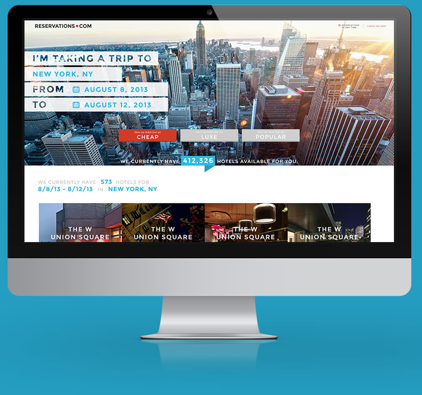
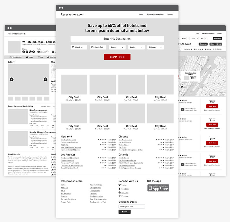
Because Expedia’s initial idea was sparked by the URL, we used it to inform the branding. By building everything around the dot in Reservations.com, it acted as the singular unifying feature of the graphic identity.

Information
architecture
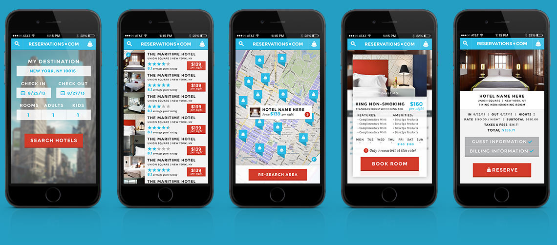
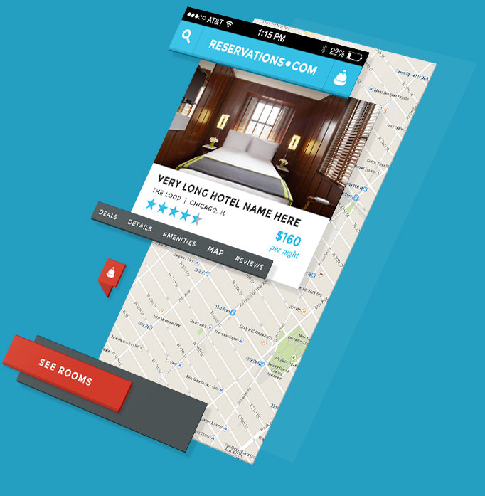
Our goal was to create an experience in which users would be tempted to wander and explore, but still find the efficiency they expect from other Expedia-owned travel aggregator sites.
To solve for both, we devoted significant time to the experience’s information architecture. What could users do on this site? How should each feature be layered on? How do we encourage discovery without impeding action?
Look and feel
To land the right look and feel, we went through a very iterative process. Simply put, we wanted to create something big and bold while taking advantage of readily available photography.
But we wanted to break from the standard method of drawing users through a site with bright buttons that scream, “Look! Do this now!” Rather, through deliberate art direction and purposeful photography, we guided users toward the most beautiful parts of every page. This design agenda ensured that users never arrived at something because they felt like it was their only option.

Desing
Most travel sites require users effort to filter down through an endless number of options. But there’s nothing predictive about that experience; the user has to explicitly say what they want, over and over.
We set out to create an experience that felt as intuitive as finishing a sentence. From “I want to go to….” to “I want my travel date to be around…” we’re asking questions that people are already thinking. The questions are presented one at a time and sequentially, bringing a conversational tone to a once rigid process.
Finally, when it comes to travel, we all have certain parameters we won’t compromise on. So we decided to give users three final filtering buttons that don’t beat around the bush: cheap, luxe or popular. Easy as that.