1

Common
A resident New Yorker approached us with a big idea: he had identified a gap in NYC real estate that prevented many of those aged 22 to 30 from actively participating in city housing schemes. Very few individuals in this age range have a spare $15,000 for an upfront broker's fee. The developer's idea was to turn the traditional NYC renter sequence on its head with a membership-based housing model. He wanted to purchase small properties and outfit them with shared amenities for this target market.
Services
-
Branding
-
Strategy
-
User Experience
-
Technology
-
Media & Content
-
Communication

Logo explorations & grid system
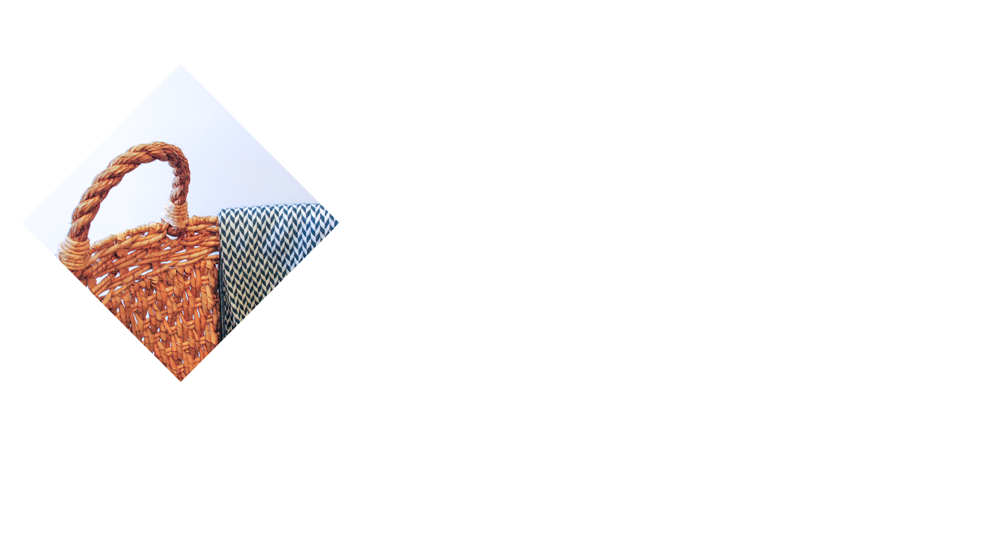
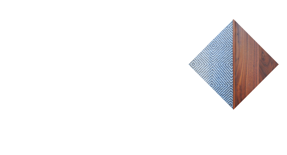
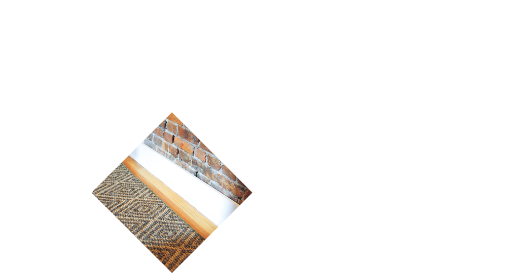
Throughout the discovery process, we realized the brand identity existed within the properties. Each development site – classic brownstones of the late 19th century variety – shared similar architecture and materiality, characterized by herringbone floors, brick patterns, and wood strip patterns.
Referencing this inspiration, we rid the brand of its previous title “Porchlight,” —a name with little urban relevance or communal significance—and declared “Common” the new moniker. The commonality amongst these architectural elements across various city locales, the commonality the founder sought to build within rental spaces, the commonality of a realistic living desire within the target market.With one word, we had described a place that values shared space and common sense, a place where one doesn't need to push boundaries to cultivate personality.
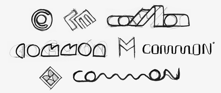
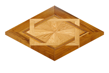
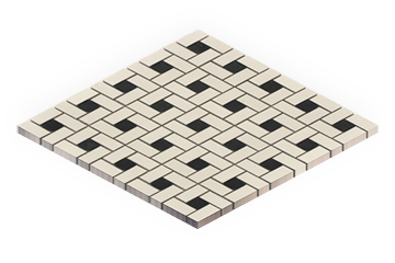
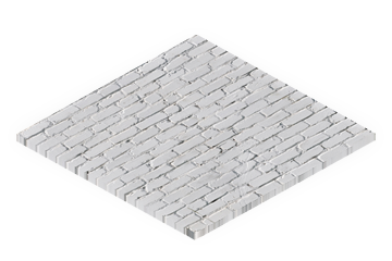

We visualized the brand architecture with growth and adaptability in mind. We created a truly flexible system that could adjust to future projects and remain easily identifiable. Like Common's development properties, we needed to build a strong foundation that could accommodate new residences.
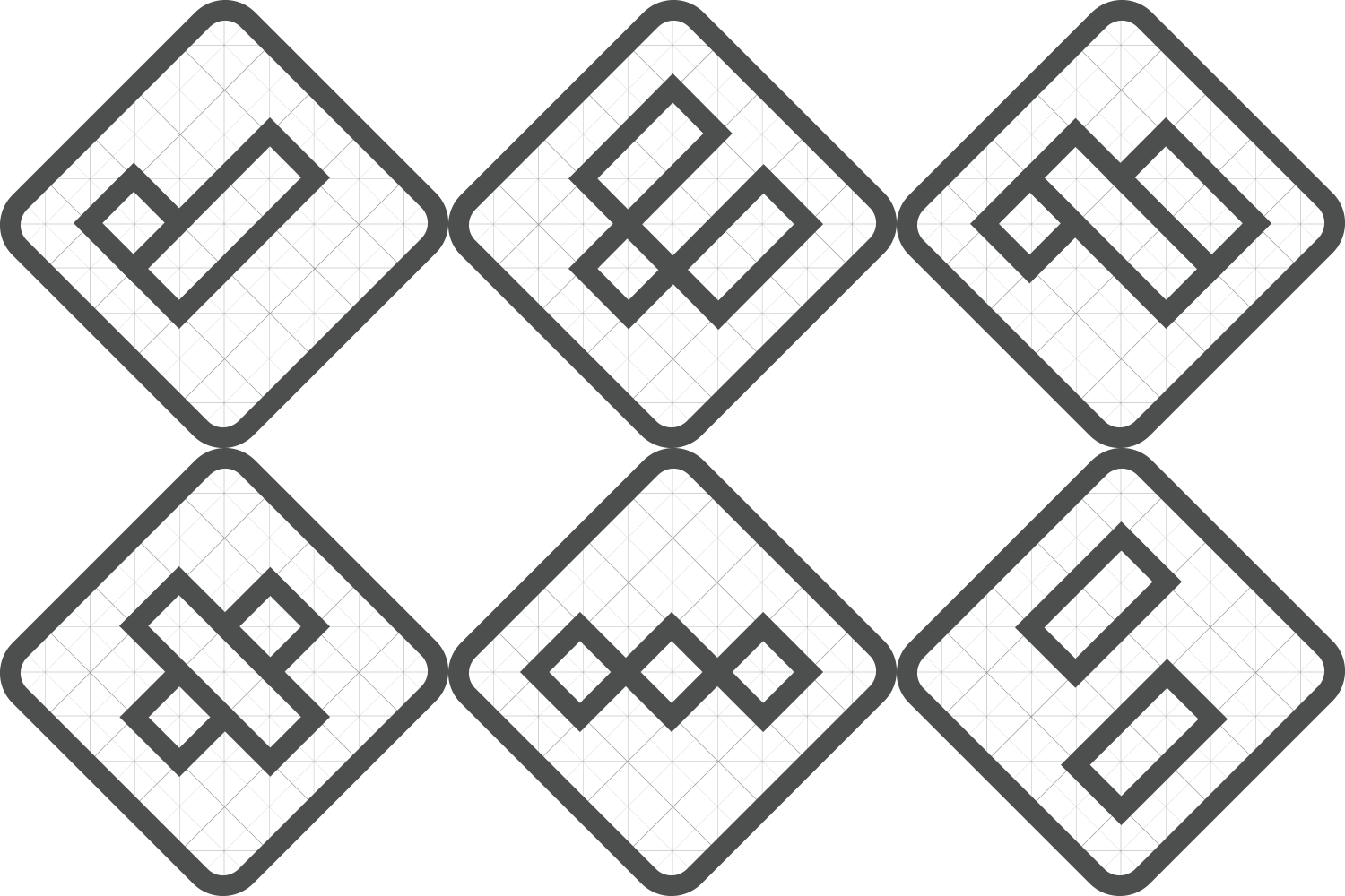
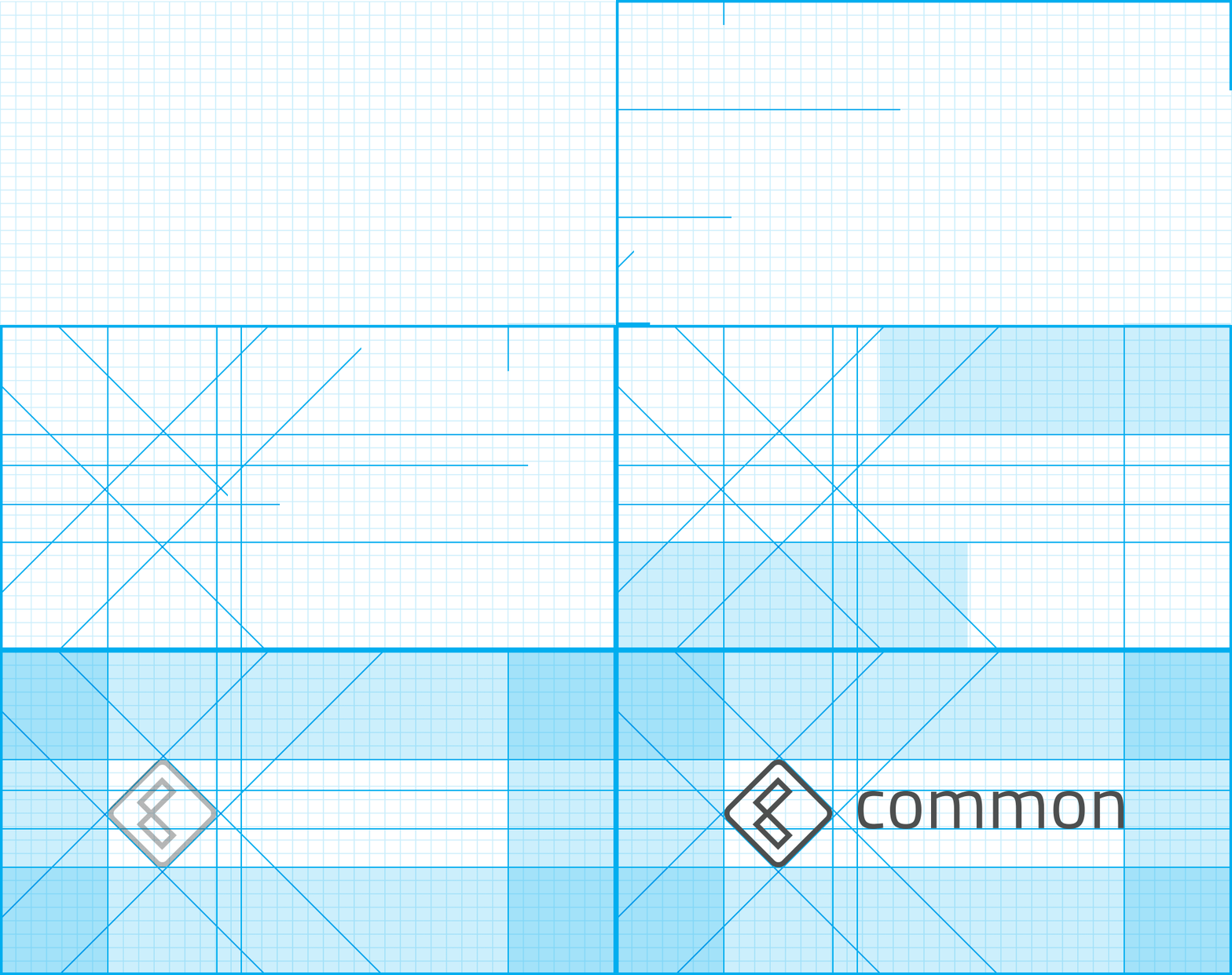
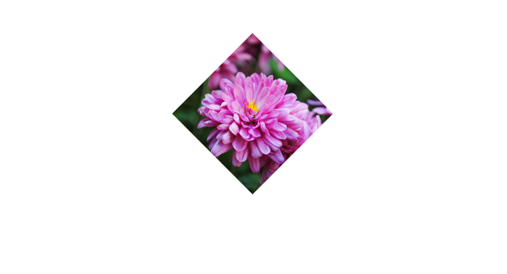
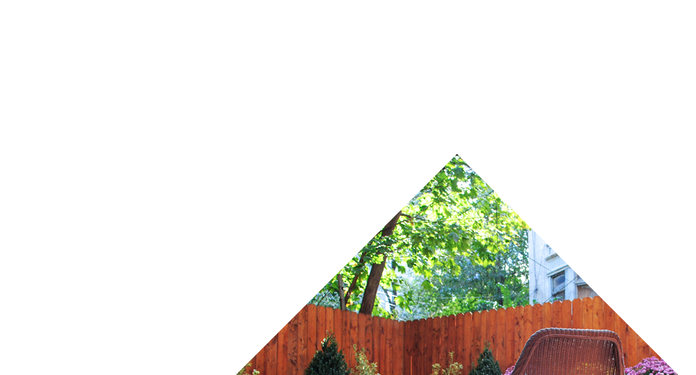
Designed to emulate the diamond grid system of floors, walls, and tiles in New York apartments, Common's logo serves as the brand's most fundamental element, and highlights the evolving urban landscape.
Within the diamond – which represents common areas – two elements coexist and symbolize the C of “Common.” The rhombus grid brands Common and highlights interior spaces to be shaped by future rental properties.
Typography & Color
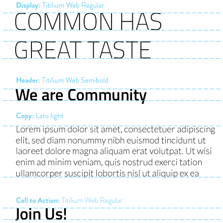
We used the open-source Google Font Titillium, a web and mobile responsive typeface representative of Common's philosophy of shared resources.
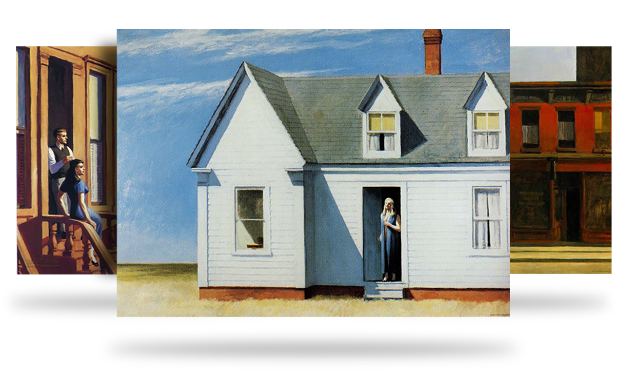
We looked to the realist artists of New York to inspire a color palette. We found this in Edward Hopper, in the mixture of cultured urbanism and rural geometrics. Light and dark colors fleeting from subdued sea and landscapes backed by strong architectural and building facades, to enliven angles and intersections.
We built a full brand system beyond the standard graphic package of the logo, color palette, or font, to define each digital, print, and spatial touchpoint.
Spatial art direction
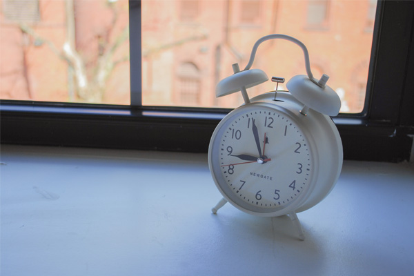
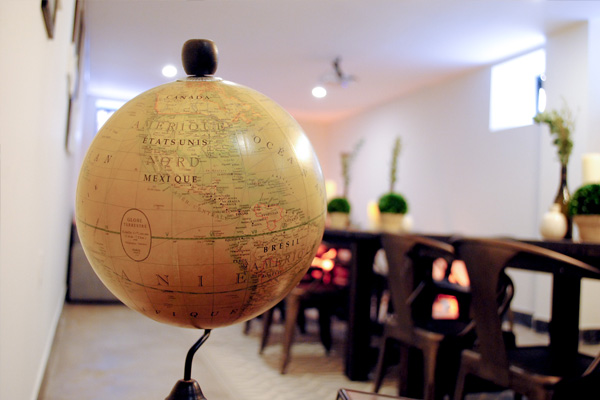
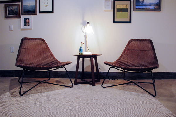
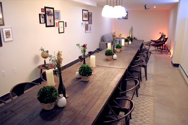
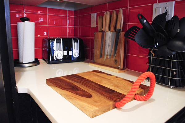
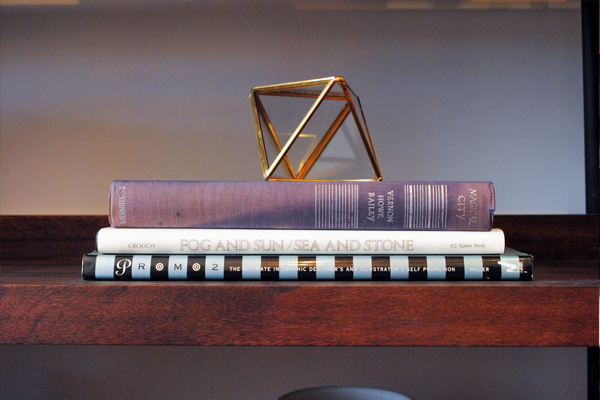
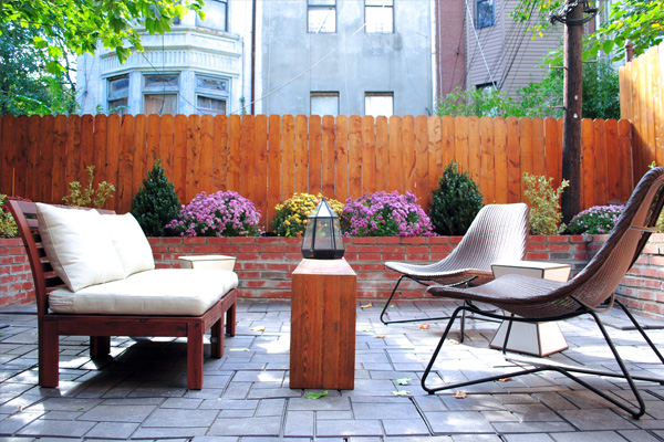
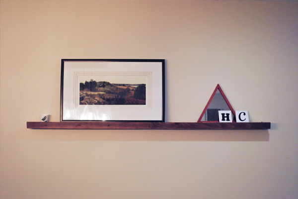
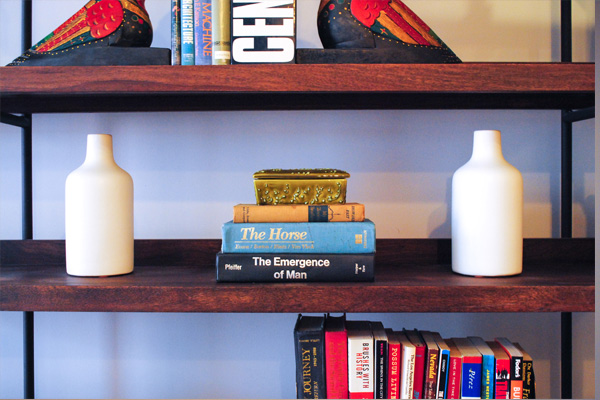
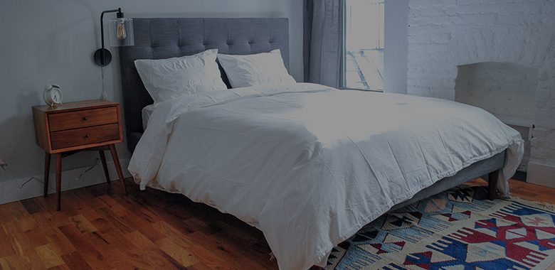
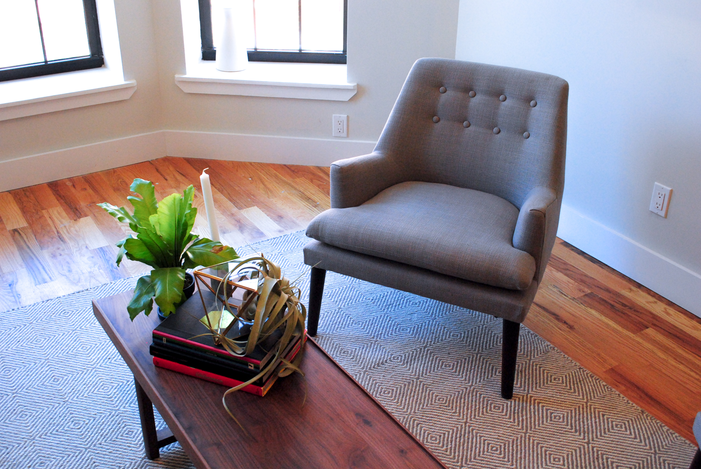
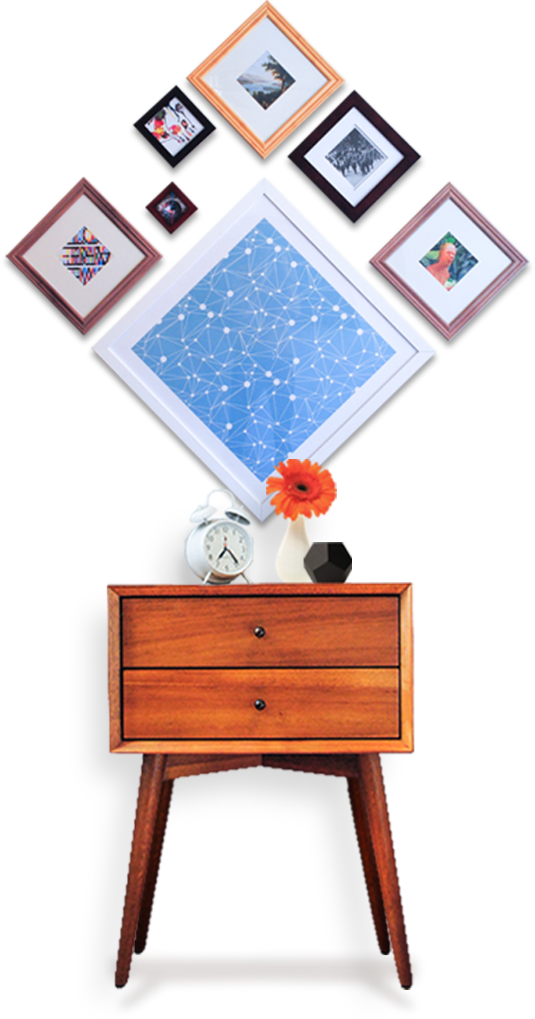
Each property was to retain its own unique elements, but upon glance recognizable under the "Common" brand identity. We had to decide what elements specifically defined a common space, determining all the sourcing metrics for choosing furniture and art; we chose individualized pieces to distinguish each home but easily allow for scaling in future endeavors. We perfected the soundscape, creating playlists to promote a specific ambience and environment.

Digital Experience
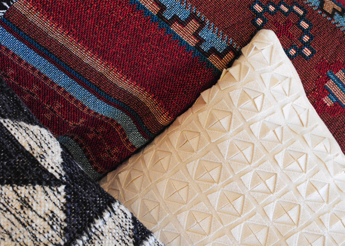
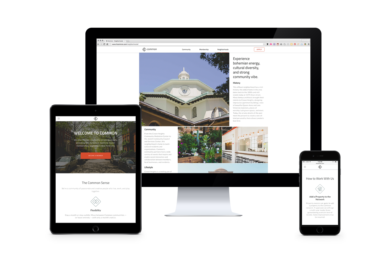
We built out the digital scope, constructing Common's web experience to function as both a manifesto and marketing site. The website introduces each neighborhood, included benefits, community partners, and most importantly, funnels new members through an intuitive onboarding process.
Press
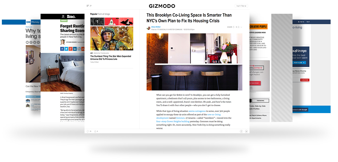


Brad Hargreaves
Founder
"Mayday has been our partner since Day 1, working alongside us to build the brand, develop our voice, and translate guidelines into reality. They have been a great collaborator in building Common's flexible, community-driving living spaces."
