1
Fluent City
Fluent City, a NYC-based language center, approached Mayday for creative insight. The company's unique language offering was not translating effectively for its rising digital audience. Instead of showcasing Fluent City as a social, after-work, cultural epicenter geared towards young professionals and adults, the online experience appeared vocational and stiff, leading to decreased engagement.
Services
-
 Branding
-
 Strategy
-
 User Experience
-
 Technology
-
 Media & Content
-
 Communication
Brand Strategy
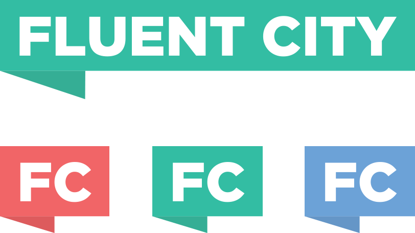
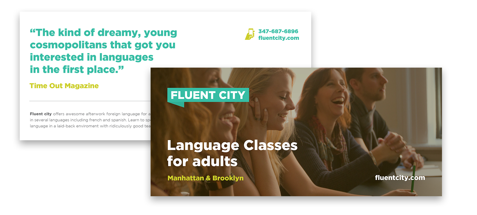
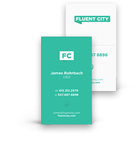
The word "fluent" embodies a brand identity of fluidity, requiring a seamless design with a recognizable logo, typography, and scalable elements. We reconstructed the previous logo - which featured the brand name positioned on distinct, colorful bubbles - by creating a single text blurb that displays Fluent City - front and center. This shifted the perception of independent, disjointed language classes to that of a collaborative learning community.
The typography remained clean and simple to build brand recognition and appeal to the company's current student structure - as well as drive future academic interest.
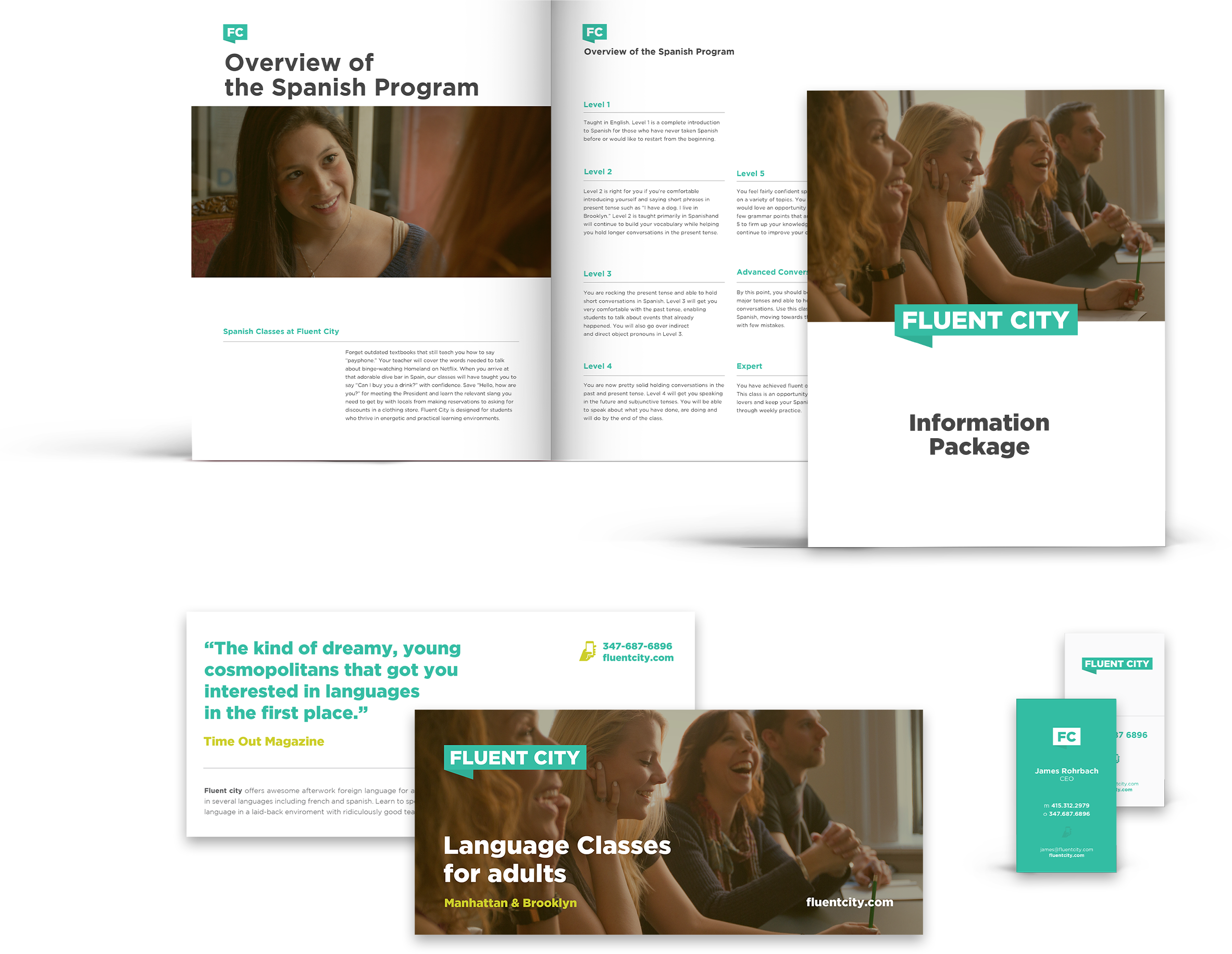
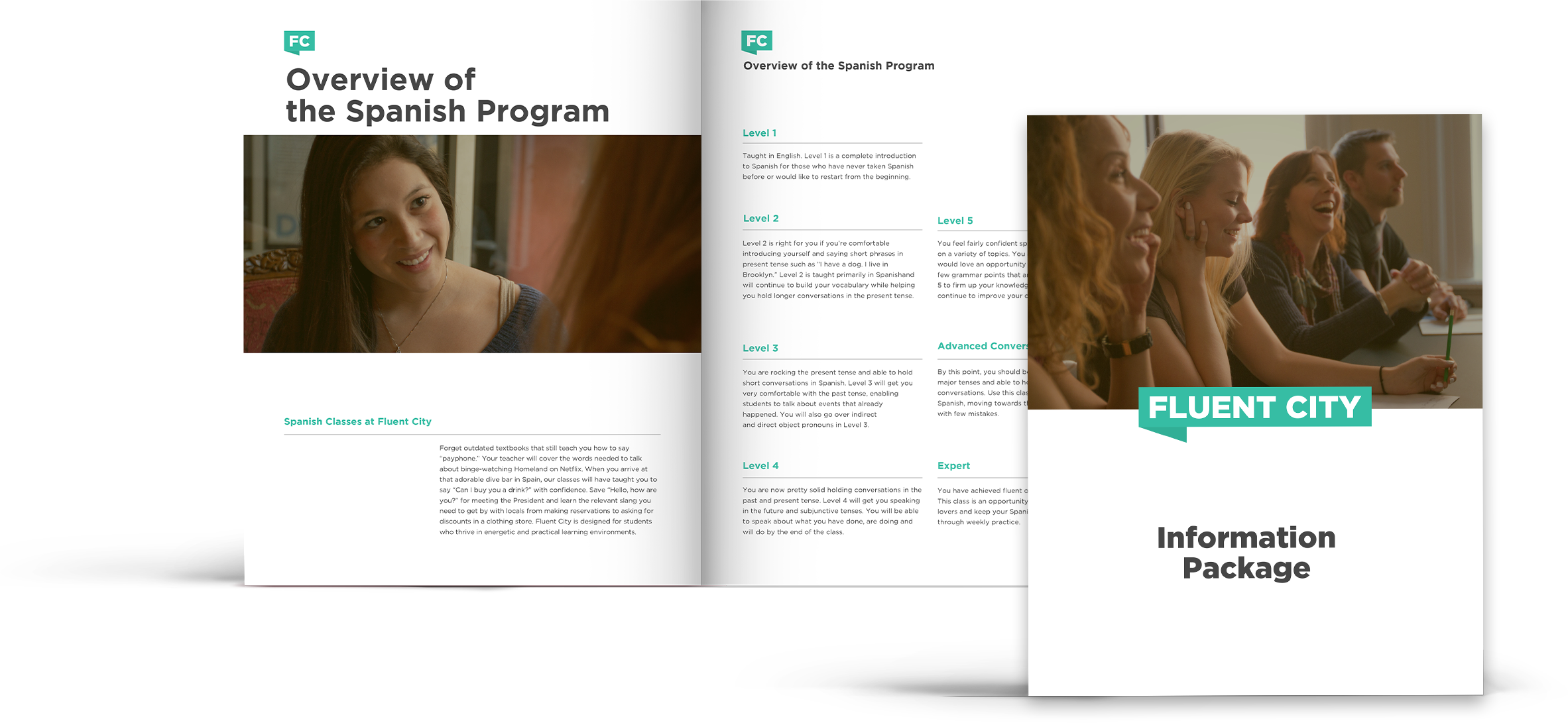
Communications & Content
Using the redesigned logo, we created branded collateral and communication materials, allowing Fluent City to translate their language offering and cultural experiences across all digital, spatial, and direct marketing platforms.
Four Cities. Ten Languages.
Fluent City sharpened its product scope, transitioning from an unspecific number of classes in various cities to a streamlined service rooted in specific urban hubs. With a renewed focus, Fluent City experienced increased engagement with its audience and embarked on new ventures such as trips abroad, expert guest speakers, and specialized cooking classes.


-

Spanish
-

French
-

Itialian
-

Portugese
-

German
-
Arabic
-

Chinese
-

Japanese
-

Russian
-

Hebrew
User Experience Design
Fluent City's text-heavy website failed to highlight the vibrant classroom atmosphere. Previously, Fluent City had relied on Yelp reviews to narrate its story, rather than using curated content. Users searched for opportunities, and found themselves inundated with information.
Mayday's design for the new website was influenced by Fluent City's unique “anti-school” approach. We sought to showcase the brand as an exceptional, language influencer and, above all, drive eager learners into the sales funnel to convert into new students for Fluent City.
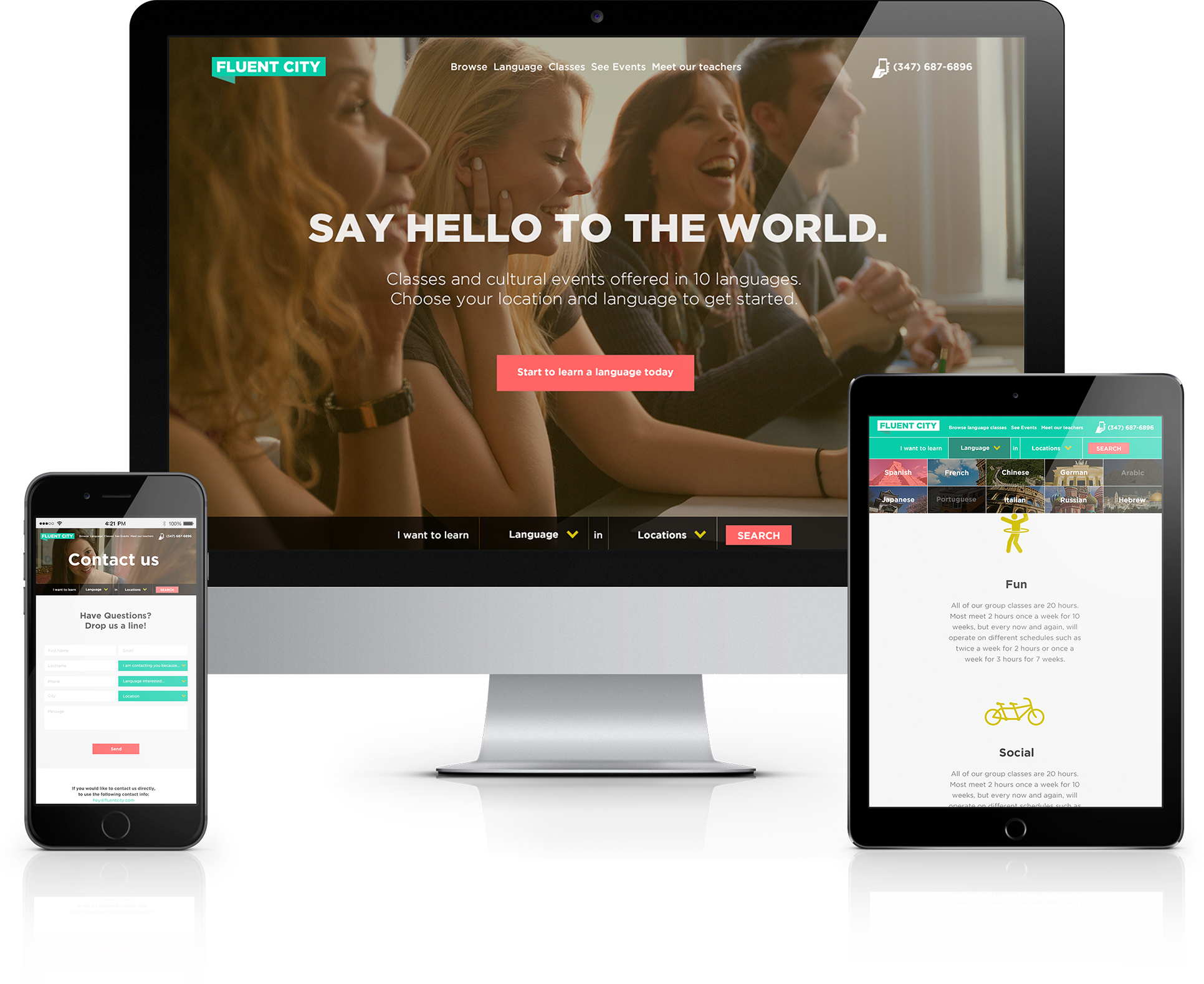
The user experience was anchored by our clean art direction. Realizing the digital platform needed to inform, educate, and onboard users quickly, we mixed rich narratives with seamless, e-commerce dynamics. We broke heavy text blocks into onboarding materials and informational content backed by strong imagery, easy navigation, and customized placement options.
Users can discover and explore, moving through the purchase flow, and filtering options by language and level. Supplementary pages such as user testimonials, recommendations, cultural events, and detailed teacher bios all serve as new calls to action.
Fluent City's brand new web experience reframed the idea of what a language school should be: improving communication skills as a way to explore the world more easily.

James Rohrbach
CEO
"Mayday has been instrumental to our success at Fluent City. We engaged them for a crucial project - total brand overhaul and new site design critical to our strategic plan. They nailed every aspect, from logo to the site - while also being consistently focused on our actual business objectives and timelines. I can't say enough good things about working with them."