1
Lightly
We engaged with Lightly in the idea stage, when the founder set out to make travel for parents easier by sending travel essentials for kids direct to the family’s destination. We helped define the Lightly offering, go-to-market strategy, brand, packaging, and built her eCommerce experience.
The Lightly brand is ethereal and “aah-inspiring.” It evokes the sense of release you hope to get from a vacation, but so rarely do as a parent traveling with kids.
Services
-
Visual Identity
-
Package Design
-
Product Styling
-
eCommerce
Packaging Design
Our Lightly sunset palette was the graphic basis for the packaging design. With solid colors, flowing single-line illustrations and a focus on the distinctice Lightly logo, each packaging choice is minimal, reflecting the ease of the Lightly servic itself.
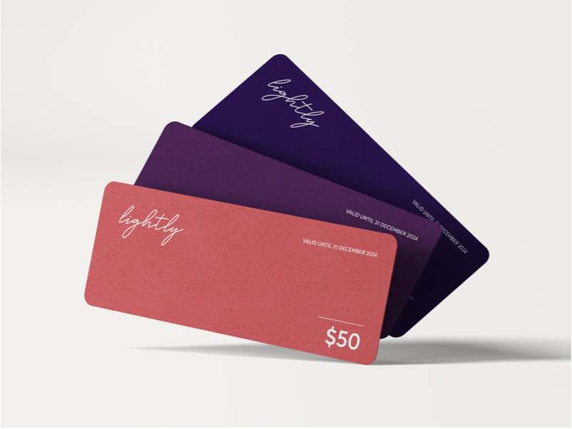
Giftcards worth Giving
The Lightly brand gradient is carried into all physical and digital collateral. Gifting is a big part of Lightly’s business model, so we made sure that the gift card itself evokes the distinctive design of the packaging and website.
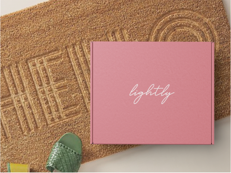
Refined Packaging
The Lightly box is subdued and minimal. Each product in the box slots perfectly into a laser cut insert for a polished look.
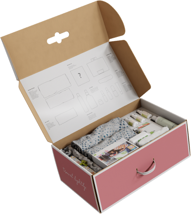
Product Discovery
The Lightly packaging experience is one of discovery. When you open your Lightly box, you see the curated selection of children’s travel products and learn more about each from the inside flap.
Product Styling
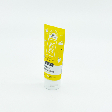
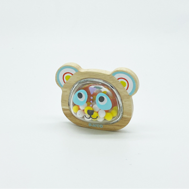
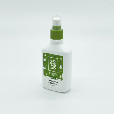
We styled and shot all Lightly products for use in advertising, eCommerce and the Lightly vending machines placed in select US airports.
Flowing Illustrations
We developed a distinctive single-line illustration style that can be animated for use in digital applications or daisy-chained together to build narratives for use in advertising.
eCommerce
We designed and built a custom Shopify store that includes gifting functionality, subscriptions, and a la carte product purchasing that can be added to preset Lightly boxes.


